
2021
|
Senior UX Writer
|
Content Creation, Research, Communication Strategy
Simplifying Complex Insurance Policies
for Halodoc Users
TLDR:
Halodoc’s Insurance Link was a breakthrough innovation, seamlessly integrating insurance benefits into Halodoc’s one-stop health service. With around 20 million monthly active users in Indonesia and 2 million users linking their insurance, the feature has made a significant impact. As a communication designer, my biggest challenge was to break down the complexities of insurance policies into digestible information, ensuring accessibility for both insurance-savvy users and those unfamiliar with it
My Role & Involvement
In this project, I took on the role of UX Writer, responsible for copy creation and communication strategy in both Indonesian and English. Although my formal title is UX Writer, this project allowed me to go beyond conventional writing tasks, applying a nuanced approach to content design that addressed both legal considerations and user experience challenges unique to the insurance industry. My goal was to shape a process that is intuitive and compliant, ensuring a seamless user journey from start to finish.
The Genesis
Halodoc played a pivotal role during the pandemic, solidifying its position in Indonesia’s healthtech sector through a key partnership with the Ministry of Health. This collaboration reinforced Halodoc’s commitment to public health, while expanding its influence in the country’s healthcare infrastructure.
A major innovation at this time was integrating health insurance into the platform, enabling users to link their insurance accounts and instantly access benefits. This streamlined process enhanced user convenience, deepened partnerships with insurance providers and contributed to increased user engagement and growth for Halodoc.
Crafting a Comprehensive Health Care
Working on Halodoc's Insurance Link really honed my content prioritization skills due to the enormous amount of information that we need to share with the users. The complexity of the context also required a deep dive into the industry to synthesize the material. Let's take a look at the final product and my approach in crafting the effective communication strategy for it!

Desk Research
To lay the groundwork for this project, I conducted extensive desk research to unpack the intricacies of Indonesia’s health insurance landscape. This involved analyzing dozens of insurance policies to identify key structures and common terminologies, which later informed our simplified categorization of benefits like Inpatient, Outpatient, and Dental. Understanding these nuances was essential for designing an information architecture that would resonate with a broad user base. By synthesizing this information into manageable sections, I set the stage for content that is both accurate and accessible, ensuring users could easily locate crucial details such as coverage limits and eligibility requirements.
Initial Crafting
With foundational research complete, I transitioned to crafting the content with a focus on guiding users seamlessly through the process of linking their insurance policies on Halodoc. Knowing this feature was new to most users, I intentionally highlighted immediate value, such as quick access to benefits and the “Chat with Doctor” feature, to encourage users to explore their insurance benefits right away.
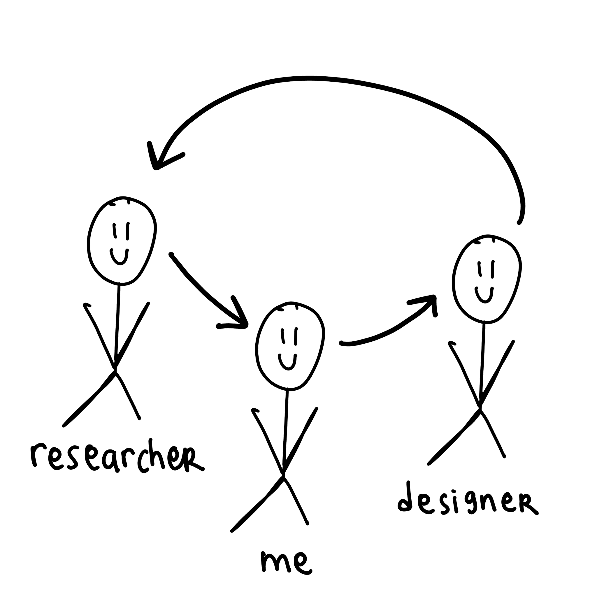
Throughout this phase, I collaborated closely with our UX Designers to align content placement and visuals, ensuring clarity and ease of use. Working with our researcher, Metaniawati Limanto, I integrated insights from user testing—such as the importance of explaining “house rules” for coverage eligibility (e.g., selecting doctors marked with the blue logo). These insights helped refine the messaging to accommodate users’ varying familiarity with insurance, balancing essential details with an approachable tone.
Iterations & Feedback Gathering
Recognizing the importance of iteration, I gathered feedback from multiple stakeholders to ensure compliance with legal and regulatory standards without compromising user-friendliness. The research insights also played a significant role in refining the content to resonate with our audience. For example, user feedback revealed that coverage limits were a high-priority detail, so I emphasized these in a straightforward one-liner format, ensuring users could quickly locate and understand their benefit limits.
Each round of feedback allowed me to make targeted adjustments, such as clarifying limitations for in-app consultations in the onboarding guide. These refinements contributed to a polished final product that met both business objectives and user needs, transforming a complex insurance feature into a straightforward, user-friendly experience.

Prioritizing What Matters to Our Users
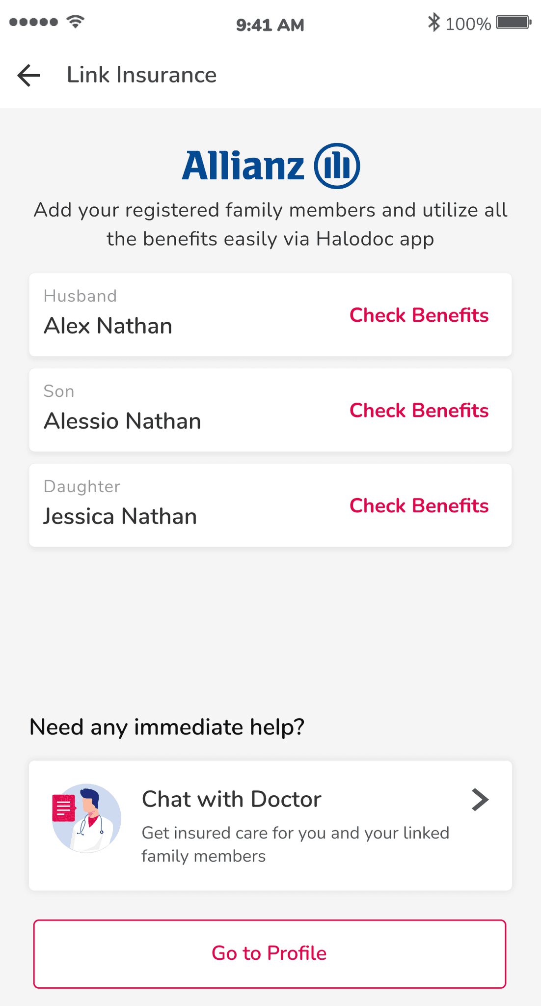
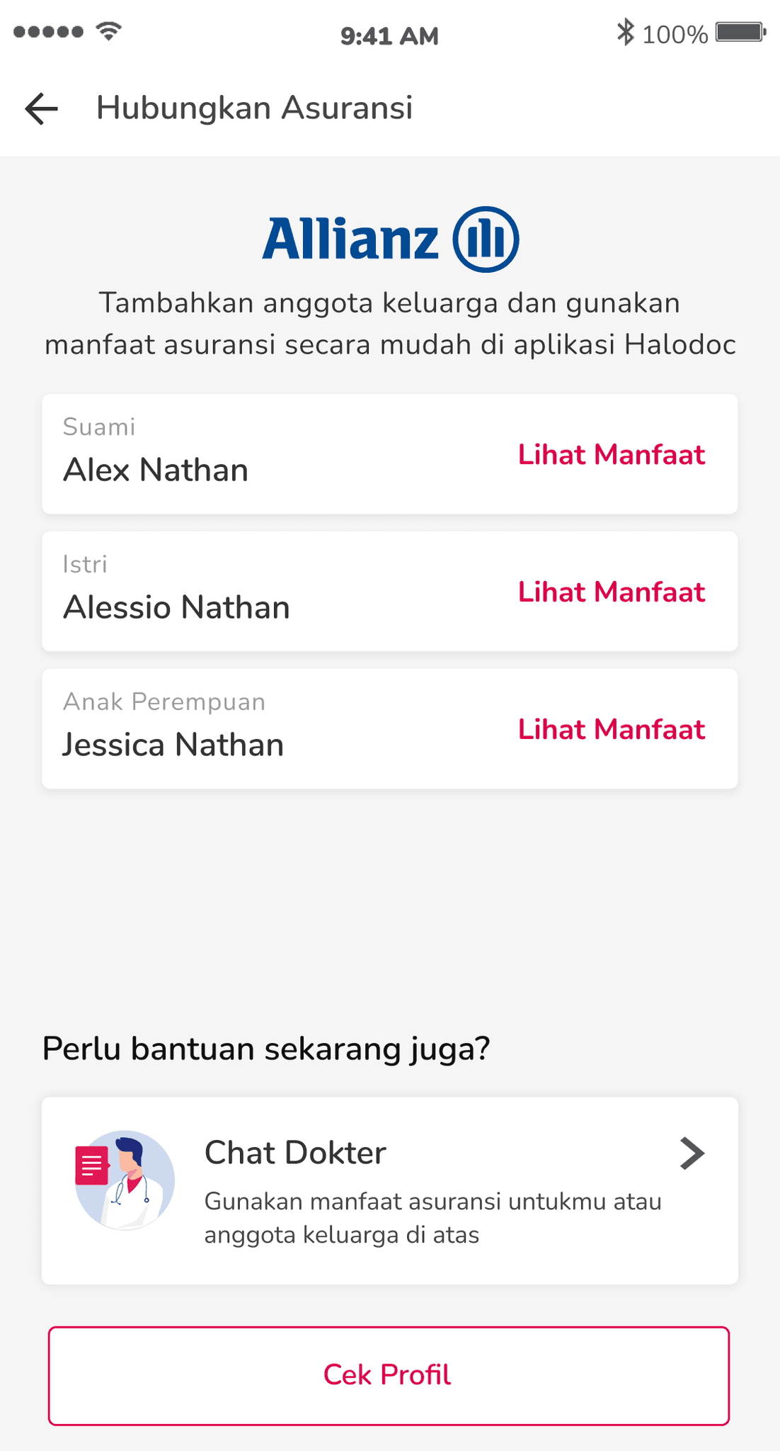
Our research showed that users with linked family members highly value immediate access to their family’s insurance coverage details. To meet this need, we designed a clear, user-centered page where family members’ names and coverage statuses are prominently displayed right after the insurance is linked. This prioritization ensures that users can quickly confirm coverage for each family member without navigating away from the main screen.
I crafted the "Need any immediate help?" prompt to capture users' attention at a crucial moment, right after they’ve linked their insurance. This phrasing is intentionally direct and action-oriented, urging users to explore the benefits of their integrated coverage immediately. By positioning this prompt alongside the "Chat with Doctor" feature, I aimed to make it as easy as possible for users to take advantage of their benefits, whether for themselves or their family members. To further streamline the experience, we included the "Go to Profile" button for quick access to account details, enabling users to manage family information and coverage status in one place.
Highlighting Key Details to Prevent Information Overload
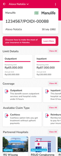
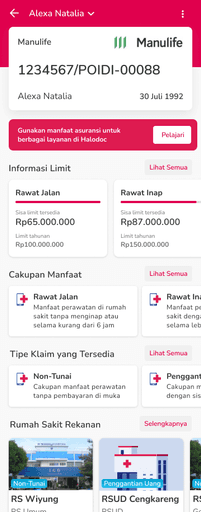
Given the dense mix of text and numerical data, we designed this page with a clear strategy to keep information accessible and intuitive. As the central hub for all insurance-related content, this page serves as a gateway, encouraging users to explore further while ensuring they can easily find the most critical details at a glance.
Our research identified that users primarily seek their remaining policy limit, so we positioned this information prominently at the top. I focused on making the available limit more visible than the annual limit, using size and placement to guide users' eyes to what’s immediately relevant. This distinction helps prevent confusion, enabling users to instantly see what portion of their benefits is still accessible. Additionally, we included the "Learn More" button, a clear call-to-action that invites users to understand how they can maximize their insurance benefits within the Halodoc app. This button provides context without overwhelming the page, letting users dive into details only if they choose to.
Each section – covering benefits, claim types, and partnered hospitals – was carefully structured to balance information density with readability. I crafted concise, user-friendly descriptions in each section to ensure that users can grasp key details at a glance without feeling overloaded. This approach aligns with our goal of making complex insurance information clear, digestible and easy to navigate.

Turning Unfamiliarity into Action with Effective User Onboarding
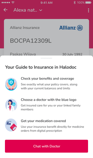
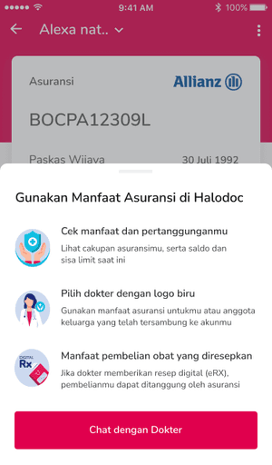
Recognizing that insurance integration in a health app is a relatively new concept, we knew that a clear and motivating onboarding experience would be essential. After users link their insurance, this pop-up acts as a guide, showing them how to make the most of their benefits with Halodoc’s services.
I focused on clarifying both the why (why using insurance on Halodoc is advantageous) and the how (how to easily navigate coverage options). To keep the information digestible, I streamlined the content into three actionable steps: checking benefits, choosing a covered doctor and getting medication with insurance coverage. Each step is paired with a simple icon and a concise explanation to ensure immediate clarity. By guiding users through these initial steps, we transformed a potentially unfamiliar feature into a user-friendly experience that encourages engagement and confidence.
Funneling Complex Information into Manageable Chunks
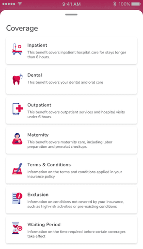
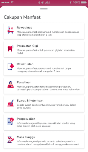
This page organizes all available benefits under the user’s insurance policy, serving as a straightforward gateway to more detailed information accessible through each card. Recognizing the overwhelming amount of details typically included in insurance policies, I focused on breaking down content into smaller, manageable sections. This approach enables users to navigate through their options at their own pace, without feeling inundated by information.
To create a user-friendly structure, I synthesized dozens of insurance policies, distilling them into key categories that would resonate most with users. This involved identifying major benefit areas, such as Inpatient, Dental, Outpatient and Maternity, while also including generic sections like Exclusions and Waiting Periods. It was an extensive (and sometimes mind-bending) process, but by the end, I felt equipped to discuss coverage details with any insurance agent (Thanks, Halodoc!).
This design encourages users to engage with complex information in a simplified format, ensuring they can understand and access the specifics of their policy as needed.
Keeping It Simple
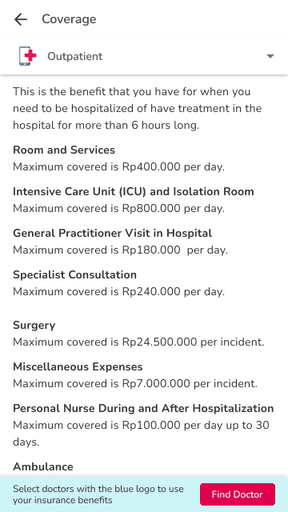
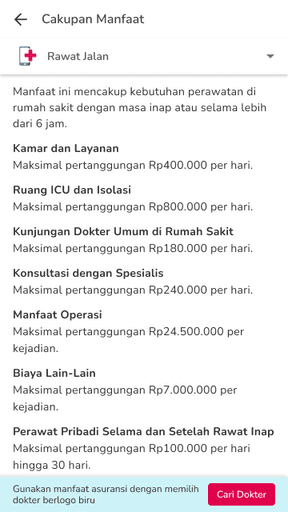
Our research revealed that users find the coverage limit for each benefit type to be the most valuable information in their insurance policy. With this insight, I crafted straightforward one-liners that communicate each benefit’s limit clearly, ensuring that users can quickly understand their entitlements and limitations. This page provides an organized overview of all benefits covered by the user’s policy, with specific details only accessible here rather than cluttering the main insurance homepage. This decision to compartmentalize information helps to reduce cognitive load, allowing users to engage with detailed policy information at their own pace, without feeling overwhelmed.
To further support usability, we included a "Find Doctor" button at the bottom, guiding users to providers that accept their insurance. The addition of this action-oriented prompt encourages users to apply their coverage directly, making the policy information feel immediately actionable and practical.

Careful Approach in Informing Limitations
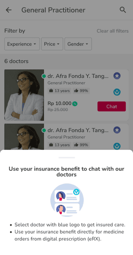
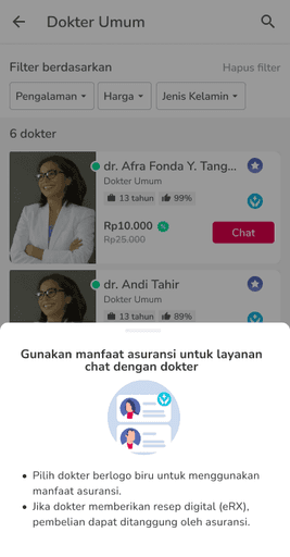
Introducing the option to use insurance benefits for in-app doctor consultations was a new feature, so we added a mini onboarding guide that appears as users browse doctor options. This guide is positioned at the perfect moment, encouraging users to make the most of their insurance benefits right when they’re selecting a provider.
I crafted the messaging to clarify that coverage is available only under two conditions: selecting doctors marked with a blue logo and ordering medications through digital prescriptions (eRX). To avoid making these limitations feel restrictive, I framed them as “house rules” – standard guidelines for using insurance within the app. This approach helps users see the conditions as natural steps in the insurance process, rather than barriers, creating a more welcoming experience. By carefully balancing clarity with an encouraging tone, this mini onboarding guide effectively educates users without overwhelming them, making the insurance usage process feel straightforward and accessible.
Personal Learning Points

Working Around Legal Restrictions on "Consultation"
At the time, legal restrictions prevented us from using the term "consultation" for anything other than face-to-face interactions with doctors. This required us to get creative with our language, finding alternative ways to describe the service while ensuring users still understood its meaning.

Various Variations
With countless variations on the market, our goal was to find a common structure that could be seamlessly integrated into the Halodoc platform. I personally reviewed about 55 different insurance policies from various companies, identifying key patterns and building a universal structure.

Accuracy vs Clarity
Insurance, much like the legal field, demands a high level of precision in wording. However, we needed also to maintain legal accuracy while ensuring the language was user-friendly. Through close collaboration with our Head of Insurance, Mit Padaliya, we were able to strike a balance that met both legal standards and user needs, ensuring clarity without overwhelming users with jargon.

Translating Jargon and Technical Terms
Most of our users have minimum knowledge of their insurance policies, often because they received it from their employers. This meant that our communication needed to avoid technical jargon while still conveying the necessary information. The goal was to make the process as straightforward as possible so the users could make informed decisions without feeling overwhelmed by the complexity of the terms.

Hand-Holding The Users
At the time, the idea of linking an insurance policy to a healthcare app and being able to check the remaining limit was relatively new, so naturally it required careful introduction to ensure users could grasp its value quickly. We focused on creating content that was intuitive and approachable, catering to both experienced insurance users and those unfamiliar with the process.

Working with Numbers & Calculation Logic
The logic behind insurance limit calculations was another layer of complexity that needed to be addressed. For example, a coverage limit could be calculated per day or per incident, and there’s also the distinction between inner limits and annual limits – which, despite sounding similar, are entirely different. We had to make sense of these nuances and present them to users in a way that was both simple and digestible.
Personal Learning Points
Role
UX Writer for Indonesian and English language
Company
Halodoc
Year
2021
Release Environment
Nation-wide in Indonesia
Collaborators
Metaniawati Limanto – UX Researcher
Arun Kumar – UX Designer
Agha Aditya – Product Manager
Mit Padaliya – Head of Insurance
Playlist That Powered This Project
Visit Halodoc